
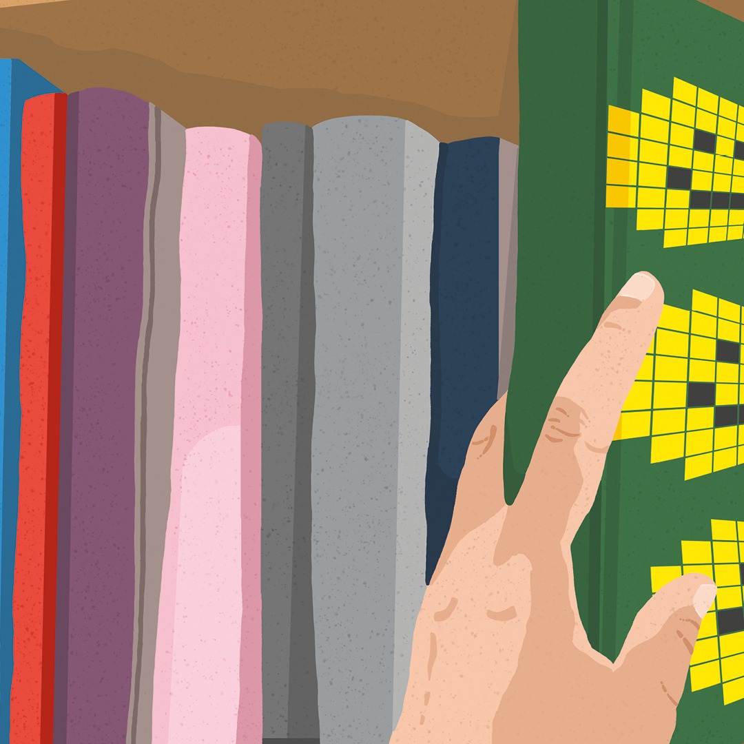
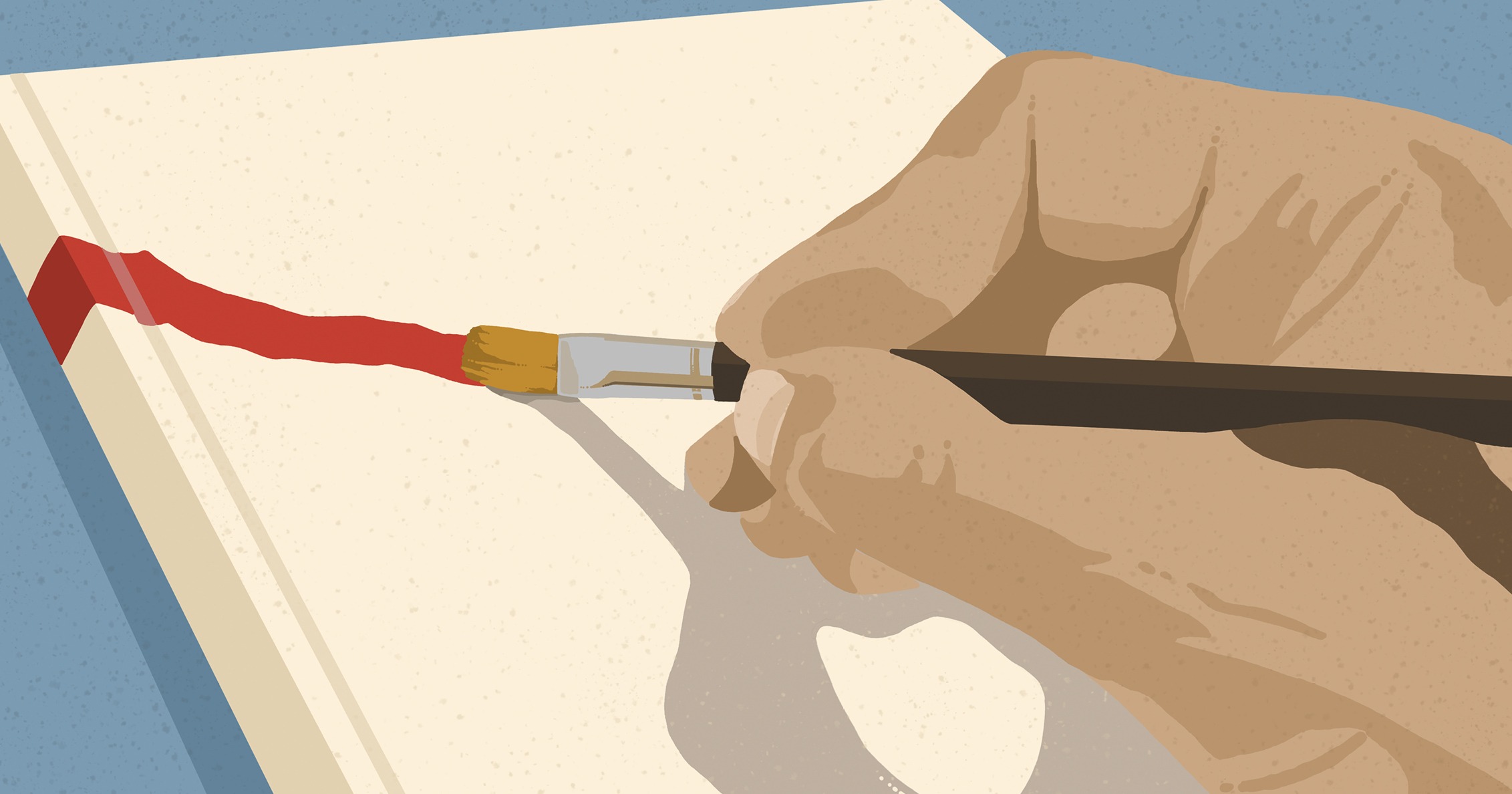
Some people love the sparkle of jewels. For others, it’s the metallic gleam of a brand new sports car. But perhaps your idea of treasure is more down to earth: an unopened book, just waiting to tell you a story. When in a bookshop or library, faced with rows upon rows of such precious gems, how often does the cover design influence your choice?
A great book cover speaks of potential. It’s the sparkle of dreaming, it’s escape, romance and adventure, it’s old-time glamour or bright modernity – all encapsulated in an image and a few words. It can be so transportive, it’s almost as if the writing inside doesn’t matter. In fact, how many times have you bought a book based purely on how it looks? Because, despite the adage, almost everyone judges a book by its cover.
Changing covers
If you’re not sure how much the perception of a book can be altered by its cover, take a look at the later 1960s and 1970s designs for Agatha Christie paperbacks created by artist Tom Adams for publisher Fontana. These creepy covers – featuring rotting bird carcasses, gaping skulls and, in the case of The Murder at the Vicarage, a vicar with a tennis racket in place of a head – gave many a young mystery fan nightmares. Based on the covers, you’d be forgiven for thinking these were dark and unsettling tales, rather than ‘cosy crime’ fiction. These days, Christie covers have entered the wild, with illustrators often free to riff on themes or plot. If you want to buy a modern version of The Murder at the Vicarage today, you can choose from around a dozen different cover designs.
Creating the magic
So how does the cover design process work? Jason Anscomb is a freelance book cover designer from Hassocks in the south-east of England. He’s designed covers for actor and travel presenter Michael Palin, for award-winning author Giles Foden and recently designed a new cover for the horror classic The Exorcist.
‘The design process starts with a brief from the publisher,’ Jason says. He then often creates a mood board. ‘This means I can quickly dump loads of visuals on a page and think through ideas without spending too long on them,’ he says.
Rather than beginning with colour or an image, design often starts with the typography – the choice of typefaces, point sizes and line and letter spacing. This is, says Jason, ‘the foundation of any decent design’. It’s why he kicks off his design process by trying out type layouts in black and white, ‘to get a sense of sizing, spacing and tone’.
Jason says that, for works of fiction, he usually tries to read a large part of the book. ‘Designs that come out of [this process] are always going to be a better representation of the writing,’ he says. Creating a coherent visual, however, changes with every title. Sometimes he finds a sentence or a strong theme in the text, or perhaps an interesting object that can act as a symbol. ‘It can feel like a desperate hunt for anything useful, but on other projects the answer comes really quickly.’
He creates a rough set of designs, then leaves it for a few days to get some distance. ‘Being able to judge if the work is actually any good is an important skill,’ he says. Out of the 10 or so rough drafts, ‘I tend to end up with maybe three to four visuals to show initially’. Jason says he likes to add a ‘gut-instinct’ design too – one that completely ignores the brief. ‘It’s where being good at explaining your designs well is vital,’ he says.
Decision time
You might imagine that the author chooses the final design, but unless you’re self-publishing, and therefore funding the cover yourself, the writer of the book is often the last person asked for an opinion. Many authors famously hate their covers (or ‘jackets’ as they’re referred to within the industry). Agatha Christie disliked the cover for her third book, Murder on the Links, so much that she insisted on an agreement for approval of all future ones.
My own debut novel was published by Penguin Books, and I was only sent the cover once the design was complete. They did change a detail on my request – one that related to the plot – but apart from that, it was out of my hands. Luckily, I loved it (seeing your bedroom-scribbled prose transformed into a book cover is an unmatched thrill), but I’m not sure how much influence I would have had even if I’d hated it.
As to who makes the final decision, Jason recalls from his time working in publishing houses that ‘everyone would stand around the computer screen and essentially pass comments about the designs they were seeing’. And who was ‘everyone’? Largely editorial and marketing colleagues, Jason says, although ‘the head of the company would sometimes poptheir head in to blow your design out of the water at the very last moment. It was actually pretty cut-throat; everything was based on a whim’.
Setting the tone
Is it a comedy novel? Expect raw, hand-drawn typography. A horror? Consider dark lettering, with a splash of blood red. ‘Typefaces definitely all have very different personalities,’ says Jason, and each one can nudge the cover towards a particular tone. For him, everything is subservient to the type – even colour and image. However, everything needs ‘to sit together in perfect visual harmony’.
On the downside, there can be a tendency to unoriginality, especially since the advent of digital publishing and the need for book titles to be recognisable in thumbnail images. Jason says this has led to huge sans-serif titles – those blocky letters obscuring any image beneath, which has created ‘an awful lot of sameness’ across book cover design.
It’s a shame, as designing a beautiful book cover is a highly underrated skill. ‘Interesting design can often be about bending rules for a good reason,’ says Jason. ‘Maybe the title text is set at the very top of the cover, creating an unusual visual balance, or the cover employs a lot of white space for effect.’
There’s also the ‘hidden design’, where a cover is built up in layers and you have to look at it in a certain way to see everything it has to offer. ‘The front cover could have holes cut out of it, with partial images revealed underneath,’ says Jason. ‘Or for a thriller, fingerprints could be added using a spot varnish (so they’re only visible when held in a certain light), or perhaps the cover is tactile and you can run your fingers over an embossed area.’
A cover you want to stroke? A secret for you to discover? A glimmer of gold, a rush of colour, a suggestion of what lies beneath? Forget splurging on a sports car or necklace. The real jewels lie upon shelves in shops and libraries, piled up in homes and warehouses. Affordable, beautiful and hinting at the adventures just a page-turn away. Go on, pick up a book now – and judge it by its cover.
Follow Stephanie’s thoughts on Substack at substack.com/stephanielam1 and on Instagram @stephanie_lam_1
Find out more about Jason’s work by visiting jasonanscomb.com, or follow him on Instagram @jay_anscomb_bookcoverdesign